![]()
Matplotlib example
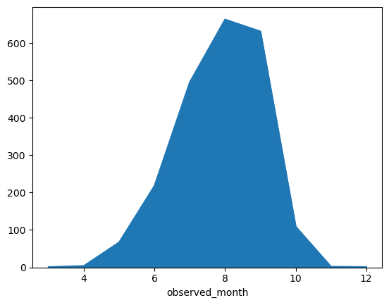
Here is an example of making a simple seasonality chart using matplotlib.
This shows observations counts by month (all years) for monarch butterflies observed in the state of Iowa.
import matplotlib.pyplot as plt
import pandas as pd

from pyinaturalist import iNatClient

client = iNatClient()
# Then, get all observations in that place of a given species
observations = client.observations.search(
    taxon_name='Danaus plexippus',
    photos=True,
    geo=True,
    geoprivacy='open',
    place_id=24,
).all()

print(len(observations))

# Convert observations to DataFrame
df = pd.DataFrame(
    [
        {
            'observed_on': obs.observed_on,
            'observed_month': obs.observed_on.month if obs.observed_on else None,
        }
        for obs in observations
    ]
)

print(df.head())
2195
                 observed_on  observed_month
0        2013-05-28 00:00:00             5.0
1        2009-08-01 00:00:00             8.0
2  2015-07-04 12:53:15-05:00             7.0
3  2015-08-19 14:04:39-05:00             8.0
4  2016-08-10 19:39:30-05:00             8.0
# Plot observation counts by month
df['observed_month'].groupby(df['observed_month']).count().plot(kind='area')
plt.show()