![]()
Seaborn examples
Here are some examples of visualizations that can be created using Seaborn.
import json
from datetime import datetime
from pprint import pprint

import matplotlib as mpl
import numpy as np
import pandas as pd
import seaborn as sns
from dateutil import tz
from matplotlib import dates
from matplotlib import pyplot as plt

from pyinaturalist import iNatClient
from pyinaturalist import pprint as inat_pprint

BASIC_OBS_COLUMNS = [
    'id',
    'observed_on',
    'location',
    'uri',
    'taxon.id',
    'taxon.name',
    'taxon.rank',
    'taxon.preferred_common_name',
    'user.login',
]
DATASET_FILENAME = 'midwest_monarchs.json'
PLOT_COLOR = '#fa7b23'
MIDWEST_STATE_IDS = [3, 20, 24, 25, 28, 32, 35, 38]  # place_ids of 8 states in the Midwest US

sns.set_theme(style='darkgrid')

# Create a client for API requests
client = iNatClient()
def date_to_mpl_day_of_year(dt):
    """Get a matplotlib-compatible date number, ignoring the year (to represent day of year)"""
    try:
        return dates.date2num(dt.replace(year=datetime.now().year))
    except ValueError:
        return None


def date_to_mpl_time(dt):
    """Get a matplotlib-compatible date number, ignoring the date (to represent time of day)"""
    try:
        return dates.date2num(dt) % 1
    except ValueError:
        return None


def to_local_tz(dt):
    """Convert a datetime object to the local time zone"""
    try:
        return dt.astimezone(tz.tzlocal())
    except (TypeError, ValueError):
        return None


def get_xlim():
    """Get limits of x axis for first and last days of the year"""
    now = datetime.now()
    xmin = dates.date2num(datetime(now.year, 1, 1))
    xmax = dates.date2num(datetime(now.year, 12, 31))
    return xmin, xmax


def get_colormap(color):
    """Make a colormap (gradient) based on the given color; copied from seaborn.axisgrid"""
    color_rgb = mpl.colors.colorConverter.to_rgb(color)
    colors = [sns.set_hls_values(color_rgb, l=l) for l in np.linspace(1, 0, 12)]
    return sns.blend_palette(colors, as_cmap=True)


def pdir(obj, sort_types=False, non_callables=False):
    attrs = {attr: type(getattr(obj, attr)).__name__ for attr in dir(obj)}
    if sort_types:
        attrs = dict(sorted(attrs.items(), key=lambda x: x[1]))
    if non_callables:
        attrs = {
            k: v
            for k, v in attrs.items()
            if v not in ['function', 'method', 'method-wrapper', 'builtin_function_or_method']
        }
    pprint(attrs, sort_dicts=not sort_types)
Get all observations for a given place and species
# Optional: search for a place ID by name
places = client.places.autocomplete(q='iowa').all()
inat_pprint({p.id: p.name for p in places})
{
    24: 'Iowa',
    1911: 'Iowa',
    2840: 'Iowa',
    8680: 'Iowa City',
    136739: 'Eastern Iowa and Minnesota Drift Plains (US EPA Level IV Ecoregion)',
    119385: 'Iowa Wetland Management District',
    208908: 'Big Sioux River Corridor South Dakota and Iowa',
    161392: 'Upper Iowa River Wildlife Management Areas',
    221041: 'Iowa KS-NE Reservation',
    207525: 'University of Northern Iowa',
    137891: 'Pammel State Park, Winterset, Iowa',
    125537: 'Terry Trueblood Wetland Exploration Trail',
    172799: 'Ashton Prairie',
    174271: 'Des Moines Iowa Park',
    151098: 'Mount Vernon, Iowa walking path'
}
# Optional: reload from previously loaded results, if available
# if exists(DATASET_FILENAME):
#    with open(DATASET_FILENAME) as f:
#        observations = Observation.from_json_file(f)
# else:

observations = client.observations.search(
    taxon_name='Danaus plexippus',
    photos=True,
    geo=True,
    geoprivacy='open',
    place_id=24,  # Iowa
).all()

# Save results for future usage (convert to JSON format for compatibility)
observations_json = [obs.to_dict() for obs in observations]
with open(DATASET_FILENAME, 'w') as f:
    json.dump(observations_json, f, indent=4, sort_keys=True, default=str)

print(f'Total observations: {len(observations)}')
Total observations: 2195
Data cleanup
# Convert observations to DataFrame
df = pd.DataFrame(
    [
        {
            'id': obs.id,
            'observed_on': obs.observed_on,
            'quality_grade': obs.quality_grade,
            'taxon.id': obs.taxon.id if obs.taxon else None,
            'taxon.name': obs.taxon.name if obs.taxon else None,
            'taxon.rank': obs.taxon.rank if obs.taxon else None,
            'taxon.preferred_common_name': obs.taxon.preferred_common_name if obs.taxon else None,
            'user.login': obs.user.login if obs.user else None,
        }
        for obs in observations
    ]
)

# Normalize timezones
df['observed_on'] = df['observed_on'].dropna().apply(to_local_tz)

# Add some extra date/time columns that matplotlib can more easily handle
df['observed_time_mp'] = df['observed_on'].apply(date_to_mpl_time)
df['observed_on_mp'] = df['observed_on'].apply(date_to_mpl_day_of_year)
# Optional: narrow down to just a few columns of interest
# pprint(list(sorted(df.columns)))
# df = df[OBS_COLUMNS]

# Optional: Hacky way of setting limits by adding outliers
# JointGrid + hexbin doesn't make it easy to do this the 'right' way without distorting the plot
# df2 = pd.DataFrame([
#    {'observed_on': datetime(2020, 1, 1, 0, 0, 0, tzinfo=tz.tzlocal()), 'quality_grade': 'research'},
#    {'observed_on': datetime(2020, 12, 31, 23, 59, 59, tzinfo=tz.tzlocal()), 'quality_grade': 'research'},
# ])
# df = df.append(df2)
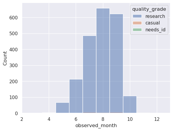
Basic seasonality plot: observation counts by month & quality grade
# Preview: Show counts by month observed X quality grade
df['observed_month'] = df['observed_on'].apply(lambda x: x.month)
df[['observed_month', 'quality_grade']].groupby(
    ['observed_month', 'quality_grade']
).size().reset_index(name='counts')
| observed_month | quality_grade | counts | |
|---|---|---|---|
| 0 | 3.0 | research | 1 |
| 1 | 4.0 | research | 4 |
| 2 | 5.0 | research | 67 |
| 3 | 6.0 | casual | 2 |
| 4 | 6.0 | needs_id | 1 |
| 5 | 6.0 | research | 214 |
| 6 | 7.0 | casual | 8 |
| 7 | 7.0 | research | 487 |
| 8 | 8.0 | casual | 6 |
| 9 | 8.0 | research | 658 |
| 10 | 9.0 | casual | 8 |
| 11 | 9.0 | research | 623 |
| 12 | 10.0 | research | 109 |
| 13 | 11.0 | casual | 2 |
| 14 | 12.0 | research | 1 |
# Plot the same data on a simple histogram
sns.histplot(data=df, x='observed_month', hue='quality_grade', bins=12, discrete=True)
<Axes: xlabel='observed_month', ylabel='Count'>
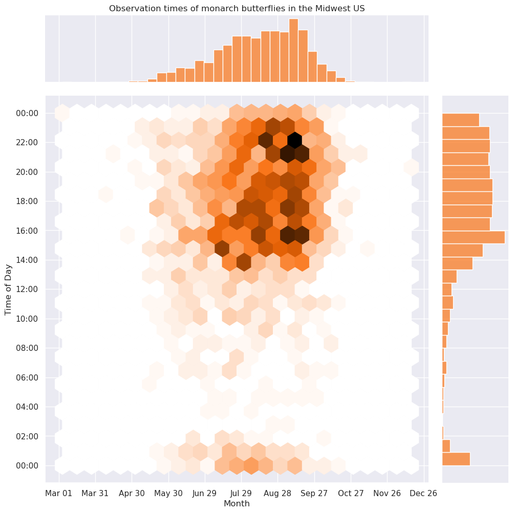
More detailed seasonality plot: observation counts by month observed & time of day
This plot uses a joint hexbin plot with marginal distributions.
It attempts to answer the question “When is the best time to see monarch butterflies in the Midwest US?”
grid = sns.JointGrid(data=df, x='observed_on_mp', y='observed_time_mp', height=10, dropna=True)
grid.ax_marg_x.set_title('Observation times of monarch butterflies in the Midwest US')

# Format X axis labels & ticks
xaxis = grid.ax_joint.get_xaxis()
xaxis.label.set_text('Month')
xaxis.set_major_locator(dates.DayLocator(interval=30))
xaxis.set_major_formatter(dates.DateFormatter('%b %d'))
# xaxis.set_minor_locator(dates.DayLocator(interval=7))
# xaxis.set_minor_formatter(dates.DateFormatter('%d'))

# Format Y axis labels & ticks
yaxis = grid.ax_joint.get_yaxis()
yaxis.label.set_text('Time of Day')
yaxis.set_major_locator(dates.HourLocator(interval=2))
yaxis.set_major_formatter(dates.DateFormatter('%H:%M'))
# yaxis.set_minor_locator(dates.HourLocator())
# yaxis.set_minor_formatter(dates.DateFormatter('%H:%M'))

# Generate a joint plot with marginal plots
# Using the hexbin plotting function, because hexagons are the bestagons.
# Also because it looks just a little like butterfly scales.
grid.plot_joint(plt.hexbin, gridsize=24, cmap=get_colormap(PLOT_COLOR))
grid.plot_marginals(sns.histplot, color=PLOT_COLOR, kde=False)
<seaborn.axisgrid.JointGrid object at 0x7f6380653cb0>
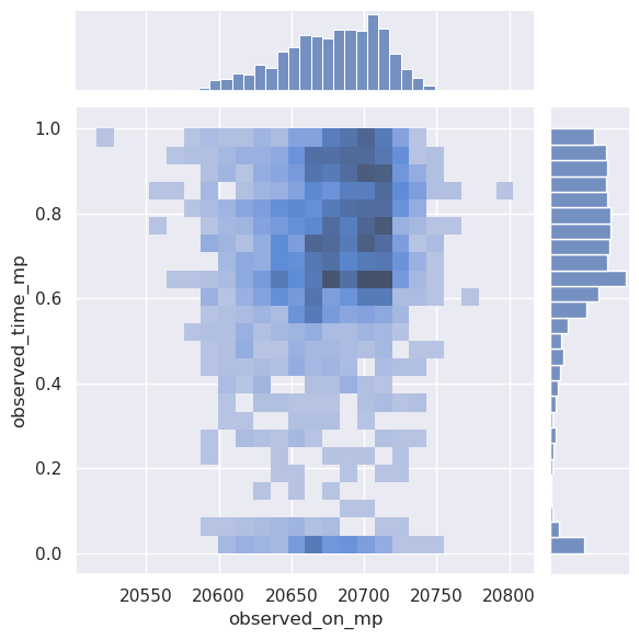
Alternate version with shorter syntax but messier labels
sns.jointplot(data=df, x='observed_on_mp', y='observed_time_mp', bins=24, kind='hist')
<seaborn.axisgrid.JointGrid object at 0x7f63784f6e90>